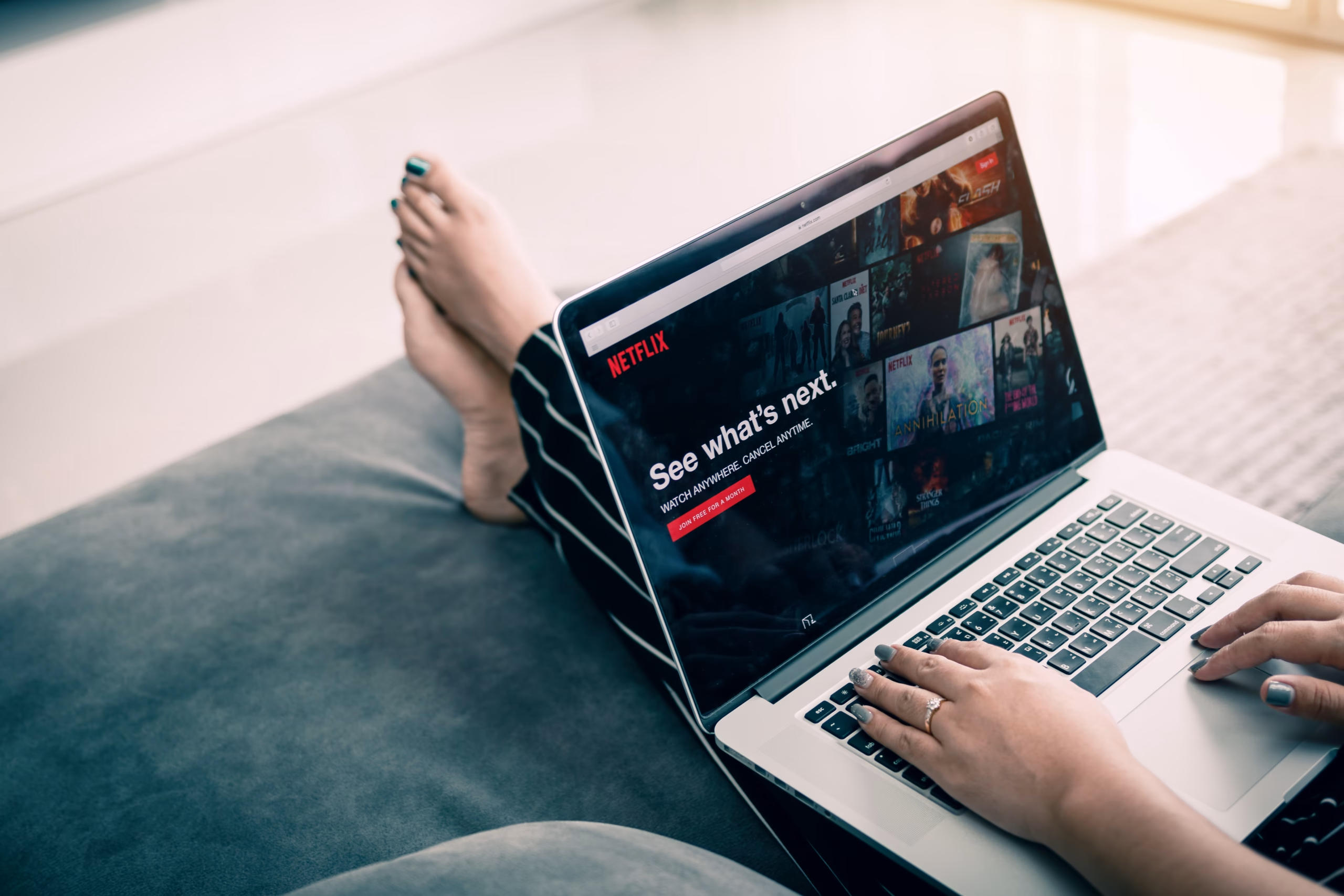
Netflix and its new TV interface: when poor UX design makes users switch off
User experience (UX) is the cornerstone of any successful digital interface. A well-designed experience goes far beyond aesthetics; it must be intuitive, seamless, and perfectly aligned with user expectations. Netflix, the undisputed leader in streaming with over 270 million subscribers worldwide, recently provided a striking case study with the rollout of its new TV interface. This example demonstrates that even major market players must never neglect the fundamental principles of UX.
A complicated navigation system that sparks real frustration
Netflix’s promise is clear: easy access to a vast catalog. Ironically, the new interface seems to contradict that promise. Many user reports highlight how navigation has become cumbersome. On platforms like Reddit and specialized forums, complaints are widespread, often labeling the new interface as “terrible” or “unusable.” The main criticism lies in the drastic reduction of visible titles on screen, dropping from numerous thumbnails to just three or four. One user, quoted by TV Guide, summed it up perfectly: “You see more titles on your phone than on an 84-inch TV. It makes NO SENSE.”
This inconsistency is striking. In an era when users are accustomed to fluid interactions on mobile devices and computers, Netflix’s TV interface feels like a step backward in usability. Content hierarchy now seems less logical, and the prioritization of certain categories at the expense of effective search functionality creates friction. For a user looking to unwind after a long day, every additional second spent searching becomes a potential source of frustration. A December 2024 study by UserTesting found that more than half of streaming users feel overwhelmed by the volume of suggested content, citing “complicated user interfaces” as a direct source of frustration—underscoring the critical importance of smooth navigation.

The direct impact on engagement and audience retention
The primary goal of an interface is to facilitate access to a service. When users have to fight the tool itself, their overall experience inevitably suffers. In Netflix’s case, poor UX has direct repercussions on key metrics:
-
Decreased engagement: difficult navigation reduces exploration time and the discovery of new content, limiting interaction with the platform. Frustrated users will spend less time browsing, potentially leading to a drop in average viewing time, though Netflix does not publicly share exact figures.
-
Increased “zapping”: frustration encourages users to exit the app or even switch to competitors offering better usability. It’s estimated that each additional second of load time or complex navigation can increase bounce rates by 5 to 10% on a mobile app—a principle that applies, to some extent, to TV interfaces as well.
-
Brand perception damage: a company that deprioritizes user experience risks damaging its reputation, even if its content remains top-notch. A few percentage points drop in customer satisfaction can significantly impact word-of-mouth and future subscriptions.
The future of UX at Netflix: between current frustrations and promising innovations
This case study reminds us that an interface is not just a visual shell. It represents the essential touchpoint between a service and its audience. A poorly designed UX, even for a dominant player like Netflix, can quickly turn initial excitement into fatigue—and ultimately push users to switch to more satisfying experiences.
However, the company isn’t standing still in the face of these engagement challenges. Experiments are underway for the future of recommendations. Netflix is reportedly exploring mood-based recommendation tools and a strategic collaboration with OpenAI (the company behind ChatGPT) to enhance its search engine. These efforts, including tests on the iPhone app, aim to enable more natural search and hyper-personalized suggestions. The stakes are high: regaining the fluidity and intelligence of the UX that powered Netflix’s initial success, turning current frustration into anticipation for the next generation of streaming services.
UX: a strategic investment for your digital success
The Netflix case is a powerful reminder: poor user experience comes at a high cost—in engagement, retention, and brand perception. At ENEON, we understand that UX is not a detail but the engine of your growth. We turn your interface challenges into opportunities for conversion and customer loyalty.
Want to turn your UX into a competitive advantage? Let’s talk.
